Weekly Wrap
Another interesting week, with significant developments across various sectors and economic indicators. Both the S&P 500 and Nasdaq reached new record highs, driven primarily by robust performances in the tech sector. Nvidia's rise to become the world's most valuable company exemplified the strength in technology stocks, particularly those involved in artificial intelligence. The energy and real estate sectors also showed notable gains, reflecting broader market optimism.
Retail sales in May increased by a modest 0.1%, below the forecasted 0.3%, indicating cautious consumer spending amid high borrowing costs and prices. Despite this, household net worth hit an all-time high of $160 trillion in the first quarter, largely driven by gains in equity holdings and real estate. Industrial production showed strength, contributing to a mixed but overall positive economic outlook. However, the labor market remained stable, with ongoing concerns about the potential impact of high interest rates on consumer behavior.
Investor sentiment was buoyed by expectations of potential interest rate cuts by the Federal Reserve. The Fed's decision to hold interest rates steady at 5.25% - 5.5% was seen as a precursor to possible rate reductions later in the year, aimed at supporting economic growth and easing borrowing costs. The CME FedWatch tool showed a 90% chance rates are unchanged after the July FOMC meeting but a roughly 66% chance of being at least 1/4-point lower after the Sept meeting.
The technology sector, especially semiconductor stocks, continued to drive market performance. Nvidia's significant market value rise underscored the dominance and investor enthusiasm for tech companies, particularly those with strong AI components, despite chip names ending the week with some softness (see weekly performance heatmap below). Energy and real estate sectors benefited from the overall positive market sentiment, with investors seeking opportunities in sectors expected to perform well under potential interest rate cuts. Of note, Crude notched notable gains, closing over $80 a barrel for just the second time since April.
All-in-all, markets were characterized by record highs in major indices, driven by strong performances in the tech, energy, and real estate sectors. Economic indicators presented a mixed but overall positive outlook, with retail sales growth slowing but industrial production showing resilience. PCE (Personal Consumption Expenditures) Price Index is the Fed’s preferred yardstick for measuring inflation. We saw annual rates of 2.5% in both January and February before rising to 2.7% in March and April and the latest report is due this Friday.
Major Indices
SPY 0.00%↑
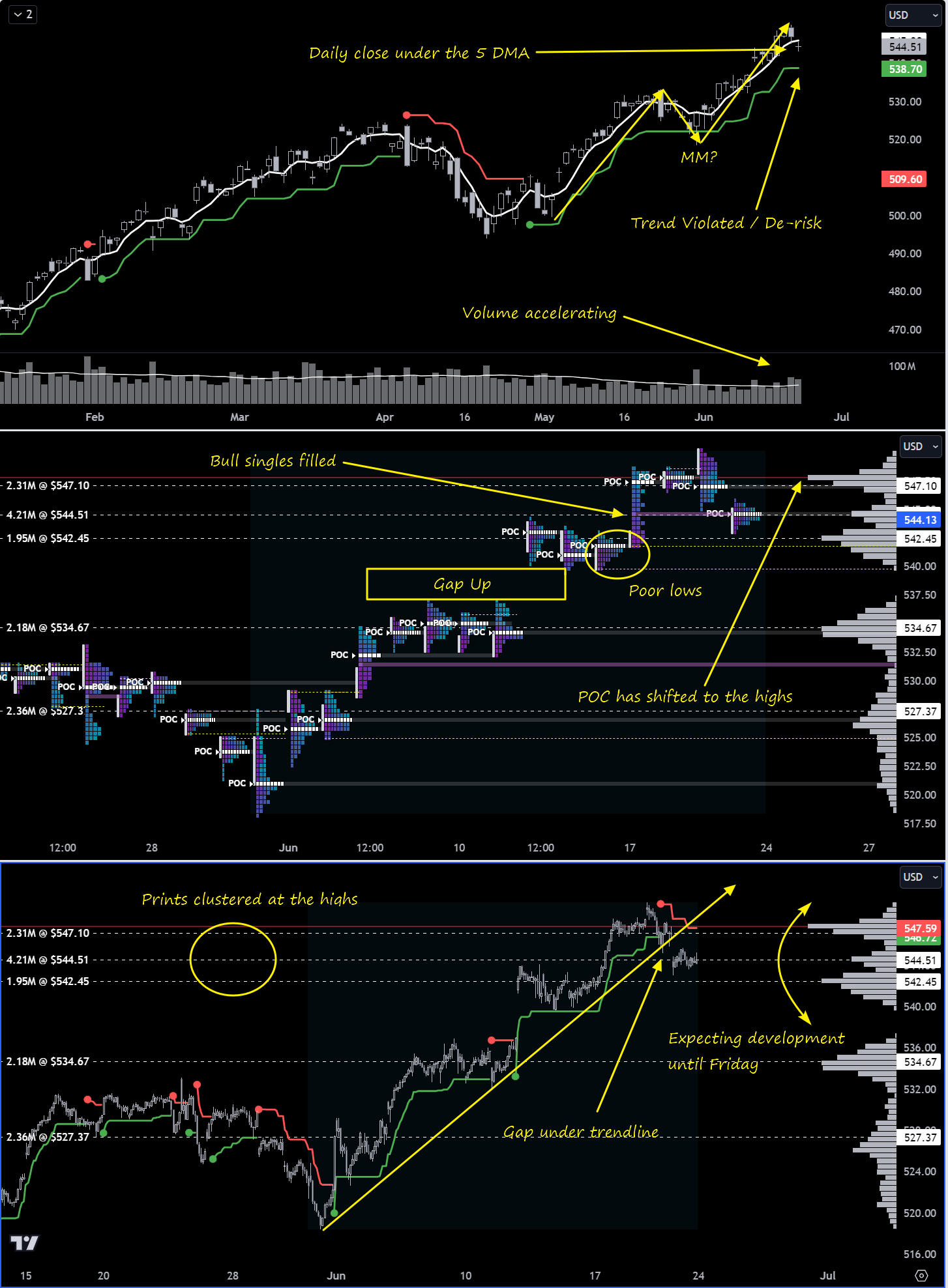
Last week I called for two-way tape in the shortened trading-week-to-come (due to Juneteenth) and we were gifted a ride up and a ride down, all capped-off with an over-hyped, super-grindy Opex with absolutely monster prints you must see in the VL platform. This week I’m cautiously on the hunt for early downside action to some areas of interest but ultimately looking for balance over the upper HVN shown in the anchored profile and continued development at $547 or $542 before PCE on Friday. PCE is sufficiently important to be market-moving and I think it just might be the news the market needs to seek “fair value” and a new auction somewhere else. Right now we’re seeing a broadening out across the market via signs of improving breadth, a pattern I discussed in last week’s stack.
Our interactive Institutional Dollar Index chart for SPY is showing sky-high readings so we know major players are trading big bucks up here. Yes, Opex played a part in the elevated readings but there are enough compelling clues in this stack and the prior stack alone to suggest that “more” is “different” this time and to start hunting a transition in the tone and tempo of the market.
Let’s break down the charts.
Top Pane / Daily View
Price has closed under the 5 DMA (white line) at $545.98. This is one of the simplest ways you can keep yourself on the right side of price - when we’re closing above, seek longs; when we’re closing below, seek shorts. You can review for yourself how closing below has in the past been an invitation of short-term weakness; likewise, trying to short when price keeps closing above has been a fool’s errand. The second indicator that paints the green lines under price in uptrends and red lines over price in downtrends is called Supertrend. It simply calculates a stopline based on an ATR multiple. You know as well as I the saying made famous by John Maynard Keynes: “Markets can remain irrational longer than you can remain solvent”. Getting offsides in a trade is one thing; staying offsides is a whole other and if you want to remain solvent you have to have a mechanism for ripping the band-aid off and closing-out. It’s for this reason that I relent to these 2 indicators as the final arbiters of any offside trades and I lean on them to provide bias on a day-to-day basis. The rules are simple:
You don’t have to follow these rules but you definitely need something. I’ll talk more about the benefits of systematizing your trade in future stacks. Right now, despite the invitation of short-term weakness as indicated by the 5DMA, Supertrend is clear that bulls are still in control of the primary trend and bears are going to have to get a daily close under $538.70 to change my mind. There are 2 other important things to note on the daily and the first is the acceleration in volume. In the face of several sessions of waning volume, we’re seeing something different and you’ll be surprised how something different is the signal. The second is the measured move (annotated “MM?”)…very nearly $38 in both legs, a curious coincidence if it turns out to be nothing else.
Middle Pane / TPO View
We’ve got some interesting artifacts of the auction that give us nice areas to engage. As traders, we want to be deliberate about when and where we engage the market to avoid over-trading - this simple behavior change can have a profound impact on your PnL. All of the 5 largest prints over the past 30 days have been in areas where the auction has been able to get a lot of business done, as evidenced by the HVN’s in the anchored profile; these are areas of heavy chop but the move out of these areas has provided clean directional trades that have allowed observant and flexible traders to play zone-to-zone quite nicely. Three of the five largest prints over the past 30 days have now found themselves clustered at the highs and have thusly moved POC in our anchored profile to the highs - this all, right now, presents as supply to me and is one of the reasons I am seeking continuation to the downside early in the week. We also have poor lows at $541.75 and $539.75…places where selling just mechanically turned off and we can likely expect re-tests at some point. $539.75 is the top of the untested-gap so I’ll be watching to see how much sellers can fill if they get down there.
Bottom Pane / 30m View
The most notable thing in this view is the gap under the trendline. Gapping under/over trendlines and SMAs is typically seen as a sign of strength or commitment. Supertrend is also used on this chart as a way of informing bias on lower timeframes but it changes intraday so I won’t call out any of its levels here. The other thing to note on this chart are the long periods of sideways chop before an explosive pop - it’s less like price discovery and more like the market is engineering liquidity. As always: maybe something, maybe nothing; I feel like these are last gasps and you already know my early-week bias, so we’ll soon see.
QQQ 0.00%↑
So, right after the markets closed on Friday, Truist comes out and says they’re cutting technology to neutral from overweight:
Impeccable timing. We looked at Large-Cap Growth’s staggering performance in last week’s stack and the news isn’t a shocker but someone calling it what it is combined with some of the recent weakness in chips and a couple other factors may create a small drag on tech in early trading this week. The breadth in the Nasdaq 100 vs Nasdaq composite confirms what we already know about which corner of the market everyone is piled into.
However, the exodus from growth may already be under way as there are some early indications suggesting rotation. Here, seen by factor:
Here, seen by sector:
And lastly, by major indices/thematic ETFs:
Note the pop in VIXM. Even when we take a look at normalized performance month-to-date, yes, QQQ is a clear winner but look at who has crept into 2nd and 3rd place:
Continue monitoring relative performance across various slices of data looking for the rotation trades. VIX, while dormant for quite some time, is apparently starting to rustle from its slumber a bit so keep an eye on vol components and surrogates
In terms of institutional involvement, like SPY, the Q’s did not disappoint:
Top Pane / Daily View
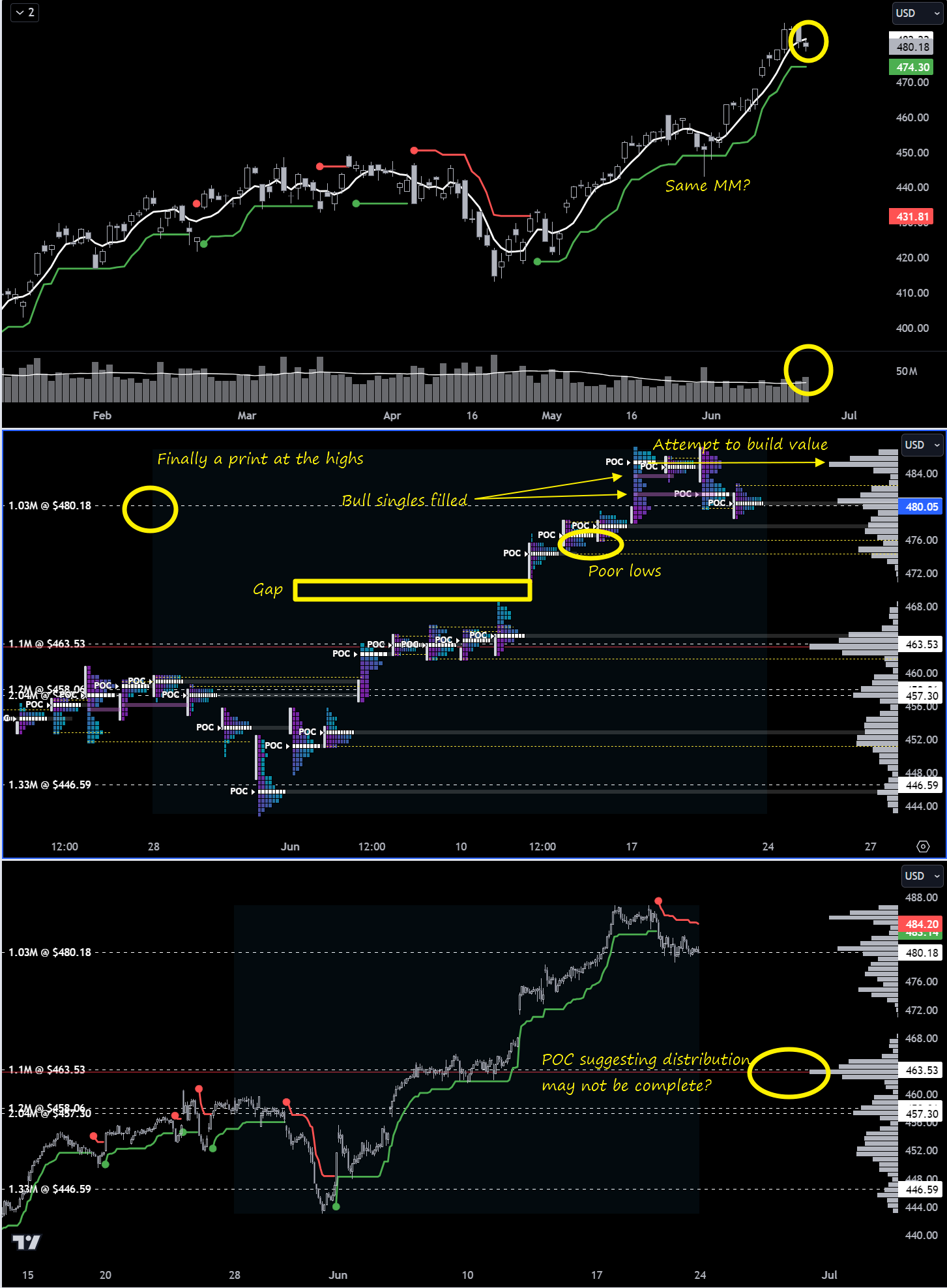
Similar chart signatures to the SPY chart. We’ve got a close under the 5DMA at $482.22 but we’re still above our Supertrend LIS at $474.30. We also have the same measured move pattern having played out (actually exceeded by a few dollars) and volume acceleration. Last week we covered some prints in the stack that suggested caution; there is still no reason to go full bear here but due to the econ data due out later this week, it’s a good time to turn off cruise control and pay attention.
Middle Pane / TPO View
We finally have a print at the highs at $480.18. I’ll be watching for rotations around that price, trying to avoid trading the chop near the print and seeking opportunities further out. To the topside we see the auction spent a good deal of time building a pivot at the highs around $485 that had to be abandoned. The fact that we continue to build volume at the highs suggests to me we’re not done exploring the top-side and until we start failing HVNs and holding re-tests from underneath will I be convinced sellers have taken the reins in a meaningful way. Anyway, the failure to hold price up there resulted in a double-D profile that suggests disagreement and we will probably find ourselves developing the middle at $483.85 at some point is my guess. To the downside we’ve got poor lows at $475.96 and $474.31 and I would love to see those cleaned up. Top of the gap is $470.80.
Bottom Pane / 30m View
Here we can see prints still clustered at the relative lows and POC still has not shifted up, potentially suggesting that distribution is not yet completed for tech. The pivot at $485 looks like the most likely candidate for POC migration right now. Opex chopped that print all day and gave day traders a real tough time holding winners in either direction; those that recognized balance early were rewarded.
IWM 0.00%↑
We’ve got very high institutional involvement, due in no small part to Opex.
Even if you wanted to dismissively chock it up to Opex, to me there’s something about the way this has set up that would have me trimming-up shorts a little bit in the short-term. Breadth is still in the gutter but let’s go to the charts to see how price is setting up right now.
Top Pane / Daily View
We’re under the Supertrend LIS at $205.91 but now closing above the 5DMA at $200.03 potentially signaling seller-weakness. Daily volume is also holding above the running 20-day average. This is important when we go to the middle pane and look at the TPO charts…
Middle Pane / TPO View
We’ve got 3 prints clustered down here at the lows. Now look at the auctions response every time price has advertised under those prints - it has bubbled right back up. You can also see price testing up into POC where a bit of a shelf has developed in the volume profile…as if someone is holding price down to finish loading the proverbial truck.
Lower Pane / 30m View
If we see price action develop sideways out of the channel, ideally with POC shifting down, look for price to pop-up impulsively for a run at the prints above. Higher timeframe areas of interest (upside and downside) are in last week’s stack. The final thing to note here is how disgusting Supertrend looks when price isn’t trending or when price is super volatile…there are no silver bullets when it comes to trading. I also discussed in prior stacks about the inside nature of the monthly and how it always yields very frustrating conditions for all but the most nimble…if you’re a momentum traders and seeing inside candles on higher timeframes, find something else to trade until you get the break from balance/consolidation.
DIA 0.00%↑
The black sheep of the four…institutions not stepping in with the same vigor we saw in the other indices at Opex. What does it mean? I don’t know. Even though institutional involvement isn’t telling me much, price is suggesting a narrative to me.
This DOW ETF is digesting the highs a bit more than SPY and QQQ and the underlying auction is subtly bullish too. Breadth is also quite good:
If we’re seeing strength in the Dow, this only lends support to the idea that we’re already seeing money rotate into new corners of the market that are less crowded.
Top Pane / Daily View
Above the 5DMA and the Supertrend LIS. Net unchanged since March but on a relative basis, a more shallow pullback after new highs. Price looks like it wants to make another run at the highs…
Middle Pane / TPO View
We can see the bear single at $393.31 holding price down. This technically says sellers are in control until filled. If buyers can pop that seller, we’ve got prints above followed by poor highs above starting at $398.87 as first destinations and then some more poor highs at the ultimate objective, ATH itself.
Lower Pane / 30m View
Higher lows are developing under that bear single, creating a bullish wedge. Price is consolidating for a directional move, presumably up. POC is at the low and dunks under the lower prints appear bought.
Top Institutional Order Flow
There are often great trades ideas or sources for inspiration in these prints. Only the top 30 of each group are shown but the full results are available in VL for you to browse at your leisure. Don’t forget to setup real-time alerts inside the platform so you never miss institutional order flow that piques your interest. Blue charts include all trade types including blocks on lit exchanges; red/orange charts are dark pool only trades; green charts are sweeps only. Here is a brief refresher on the difference between dark pool flow and sweeps
💰Mag7 MoneyFlow💰
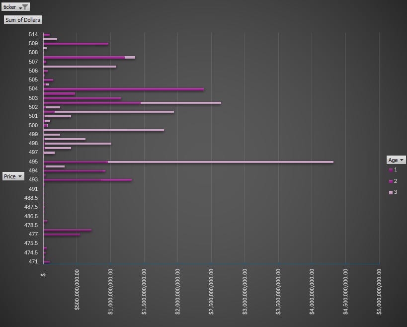
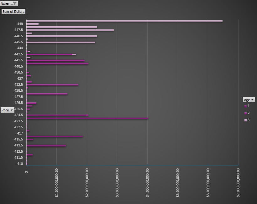
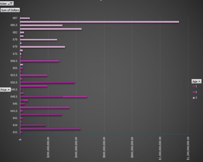
When we look at moneyflow charts, we’re visualizing the aggregate institutional activity by price for a given period. The benefit of moneyflow charts is that you have an apples-to-apples comparison of institutional involvement across the entire market because everything is measured by the same yardstick: dollars. If you are familiar with auction mechanics and volume profiling, you can apply the same principles here; large bars are magnets and show where business is being done and you can expect positioning to be tested and defended, sometimes multiple times; narrow bars represent little interest or less-success in doing business at that price and work as pass/fail levels to position and define risk against. A final note: the gradient in color represents the age of positioning; the darkest colors are roughly 3 weeks old and the lightest are the most recent week.
*Note: Apple looks a bit out of sorts thanks to a new #1 trade that came in at the close on Friday…and it wasn’t even close by a long shot:
I’m going to have to mull over some data-massaging options to make this chart usable again for Apple so for now, just know that $207.49 is the line-in-the-sand you should be measuring buyer/seller success against in coming sessions.
Summary Of Thematic Performance
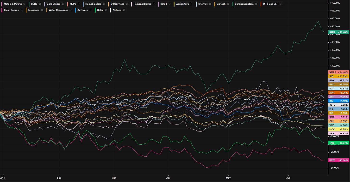
VL provides a lot of pre-built filters for thematics so that you can quickly dive into specific areas of the market. These performance overviews are provided here only for inspiration. Consider targeting leaders and/or laggards in the best and worst sectors, for example.
YTD S&P Sector Performance vs SPY (benchmark)
YTD S&P Industry Performance vs SPY (benchmark)
YTD Performance: Energy
YTD Performance: Metals
YTD Performance: Agriculture
YTD Performance: Country ETFs
Econ Events On Deck This Week
Here are key economic events happening this week that have the potential to cause outsized moves in the market or heightened short-term volatility.










Awesome article
What's a poor low/high?