


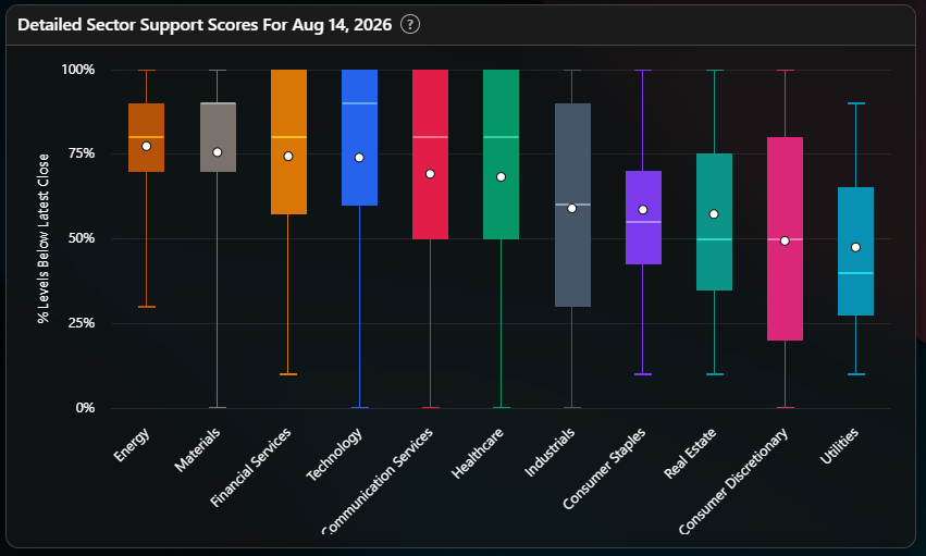
Every week I show a chart like the one above, a box for each sector, a dot inside each box, whiskers running out the top and bottom. It looks like a lot to take in at a glance. It is actually only two ideas layered on top of each other, and once you have both, you can read the whole chart in about five seconds.
Take the example above. Real Estate and Utilities have almost identical average scores, in the high 40s to high 50s, both unremarkable, both easy to skim past as “middling.” One of those two sectors is an honest middling. The other is a mediocre average built by a few strong names propping up a weaker group underneath. You cannot tell which is which from the average alone. You can tell instantly from the box. That is what the rest of this guide teaches you to see.
What you are actually looking at
Every sector on my board is really ten to sixty individual tickers, each with its own support score from 0 to 10, the share of that ticker’s ten most significant areas of high-volume institutional engagement currently sitting below the price. The headline sector number in the weekly heatmap is just the average of those tickers. This chart is what is underneath that average.
Two different ideas share the same picture, and they answer two different questions.
The dot is breadth. It is the sector’s average score, the same number that shows up in the weekly heatmap. Reading the dots left to right tells you which sectors have more names above their institutional levels right now.
The box and whiskers are dispersion. They tell you nothing about whether the sector is strong or weak. They tell you whether the names inside it agree with each other. The line through the middle of the box is the median, the typical name. The box itself holds the middle 50 percent of names. The whiskers stretch out to the weakest and the strongest name in the sector.
Those are genuinely different questions, and a sector can score well on one and poorly on the other. That is the entire reason this chart exists, and it is the reason the average by itself can mislead you.
Height is the first signal
A short box means the names in that sector broadly agree with each other. A tall box means they do not, and the average is hiding a split.
Put that together with where the dot sits and you get four honest read-outs:
A high dot with a short box is uniform strength, a real trend you can lean on, because most of the names in the sector are actually participating.
A low dot with a short box is uniform weakness. Not a soft average, a consensus. Most names have already broken their levels.
Any dot at all sitting above a tall box is an argument, not a trend. The sector label is telling you almost nothing. The individual name is telling you almost everything.
Think of it the way you would a classroom grade. A short box is a class where everyone scored within a few points of each other, the average genuinely describes the room. A tall box is a class with a few students acing the test and a few failing it, and the average sits somewhere in the middle describing nobody in particular.
In the example chart, Energy and Materials show the short-box, high-dot pattern, tight boxes, dot and median close together. That combination is about as close as this data gets to genuine, broad, believe-it strength, whenever you see it, in any sector, in any week.
Technology, Communication Services, Healthcare, Industrials, and Consumer Discretionary show the opposite pattern in that same example, tall boxes, whiskers running from near zero up to 100. Consumer Discretionary’s box happens to be the widest one on that particular chart, stretching from roughly 21 to 80. Whenever you see a box that wide, for any sector, the average is doing you a disservice. The honest move is to go look at the individual names.
Dot versus line is the second signal, and it is the more useful one
This is the part people skip, and it is the part that matters most.
The median ignores extremes by construction. The average feels every one of them. So the gap between the dot and the line is a direct measurement of how much a handful of outlier names are distorting the number you actually see every week.
Dot below the line means a few weak names are dragging the average down. The sector is better than its headline number looks. Most names are fine. A handful of laggards are doing all the work of making the average look worse than the typical name actually is.
Dot above the line means the opposite, and it is the more dangerous read. A few strong names are propping the average up. The sector is weaker than its headline number looks, carried by a handful of winners while the typical name underneath is worse off than the average would ever tell you.
Dot sitting right on the line means no skew. The average is an honest summary of the typical name, which is the quiet, boring, best-case outcome, and also the rarest one on this chart in my experience.
In the example, Real Estate and Utilities both show the dot-above-line pattern, the more dangerous one. Utilities in particular has a meaningful gap between its median and its dot. Whatever the headline number says for a sector showing this pattern, the typical name inside it is weaker than that number suggests, and a few names are doing the work of keeping the average respectable. Watch for this pattern specifically, it is the one most likely to fool you if you only ever look at the weekly heatmap.
Where the median sits, on its own, tells you something too
A median pinned up near the highs, at or close to 100 percent, means more than half the sector’s names are already above all ten of their institutional levels. That is genuine broad strength, independent of anything the average or the dot is doing.
A median sitting near the bottom means the opposite. More than half the names are broken, below most of their levels. That is consensus weakness, and no amount of skew in the average changes the fact that most names in that sector are struggling.
The rule of thumb
Compare the height of a box to the gap between one sector’s dot and the next sector’s dot. Most weeks, the spread inside a single sector is wider than the spread between sectors. When that is true, picking the right name inside a sector matters more than picking the right sector. The weekly heatmap will keep giving you eleven numbers to compare against each other. This chart is the reminder that, most weeks, the more important comparison is happening inside each one of those eleven boxes, not between them.
This newsletter is for informational purposes only and is not investment advice. Nothing here is a recommendation to buy or sell any security.